How to Build a High-Converting GHL Sales Funnel
Funnels Don’t Fail Because of Traffic — They Fail Because of Design and Structure
Most SMEs using GoHighLevel already have funnels.
They have:
- Landing pages
- Forms
- Calendars
- Follow-upsYet conversions remain inconsistent.At GoHighLevel Expert Services, we see this daily:Businesses blame traffic, ads, or leads — when the real issue is that the funnel was never designed to convert intent into action.A high-converting GHL sales funnel is not about stacking pages together.It’s about guiding decision-making, reducing friction, and reinforcing trust at every step.This blog breaks down how to build a GHL sales funnel that actually converts, not just one that looks “complete” inside the dashboard.
Why Most GHL Funnels Underperform
Before building, it’s important to understand why funnels fail.
Common issues include:
- Too many steps without clarity
- Pages that are not user-friendly
- Funnels that are not fully responsive on mobile
- Design that looks generic instead of intentional
- No connection between funnel pages and automationA funnel is a system, not a collection of assets.If any part feels confusing, slow, or misaligned, conversion drops — even with great leads.
What a High-Converting GHL Funnel Actually Does
A high-converting funnel must accomplish four things:
- Capture attention
- Build confidence
- Reduce anxiety
- Trigger the next action.This happens through the combined work of structure, design, and automation.Excellent designs support attention.User-friendly flows reduce hesitation.Fully responsive pages protect mobile conversions.Free updates inside GHL ensure long-term performance as features evolve.
Step 1: Start With One Clear Funnel Goal
Every funnel must answer one question:What is the single action we want the visitor to take?
Examples:
- Book a call
- Request a quote
- Start a trial
- Submit an applicationMistake to avoid:Multiple CTAs fighting for attentionHigh-converting funnels are focused, not flexible.
Step 2: Design the Funnel Backwards From the Conversion
Instead of starting with the first page, start with:
- The confirmation page
- The booking success screen
- The post-submission messageThen work backwards:
- What reassurance is needed before this step?
- What objections must be removed earlier?
- What information must be clear before commitment?This approach creates a logical flow rather than guesswork.
Step 3: Build Landing Pages That Prioritize Clarity Over Creativity
Inside GHL, it’s tempting to experiment with layouts and sections.High-converting funnels do the opposite.
They use:
- Clear headlines
- Simple layouts
- Visual hierarchy
- Minimal distractionsExcellent designs are not flashy — they are intentional.Your page should answer, within 5 seconds:
- Who this is for
- What problem does it solve?
- What happens nextIf visitors need to “figure it out,” conversions drop.
Step 4: Ensure Every Funnel Page Is Fully Responsive
This is non-negotiable.
In most industries:
- 60–80% of funnel traffic is mobile
- Mobile visitors convert differently
- Small friction causes massive drop-offEvery GHL funnel page must be:
- Fully responsive across devices
- Easy to scroll
- Easy to tap
- Fast-loadingIf a button is hard to click on mobile, the funnel is broken — no matter how good the copy is.
Step 5: Make Forms Short, Purposeful, and User-Friendly
Forms are often where funnels die.
Common mistakes:
- Too many required fields
- Asking for information too early
- No explanation of why data is neededHigh-converting GHL funnels use:
- The fewest fields possible
- Clear labels
- Simple layouts
- User-friendly form spacingRemember:You’re not “collecting data.”You’re earning trust.
Step 6: Design Booking Pages to Reduce Anxiety
If your funnel leads to a calendar, that page is a decision point.
A strong booking page:
- Explains what the call is (and isn’t)
- Sets expectations clearly
- Reinforces value
- Looks professional and intentionalExcellent designs here directly reduce no-shows.A confusing booking page increases friction and hesitation.
Step 7: Align Funnel Copy With Automation Messaging
One of the biggest GHL mistakes is message mismatch.
Example:
- Funnel says, “Quick 15-minute chat.”
- Confirmation email says “60-minute consultation.”
- SMS reminder uses different wording againThis inconsistency creates doubt.High-converting funnels ensure:
- Funnel copy
- Email copy
- SMS reminders
- Calendar titlesAll use the same language and share the same expectations.Consistency builds confidence.
Step 8: Use Automation to Support the Funnel — Not Replace It
Automation should:
- Reinforce decisions
- Provide clarity
- Reduce uncertaintyAutomation should NOT:
- Overwhelm users
- Spam messages
- Replace human interactionInside GHL, a strong funnel includes:
- Instant confirmation
- Clear next-step messaging
- Reminder sequences
- Automation pauses when humans engageThis balance keeps the funnel user-friendly and trustworthy.
Step 9: Build Post-Conversion Pages That Strengthen Commitment
Most funnels stop once the form is submitted.This is a mistake.
A strong post-conversion page:
- Thanks to the user
- Reconfirms their decision
- Explains what happens next
- Reduces second-guessingThis increases:
- Show-up rates
- Response rates
- Close ratesHigh-converting funnels continue after the click.
Step 10: Optimize Funnel Speed and Simplicity
Even excellent designs fail if pages are slow.
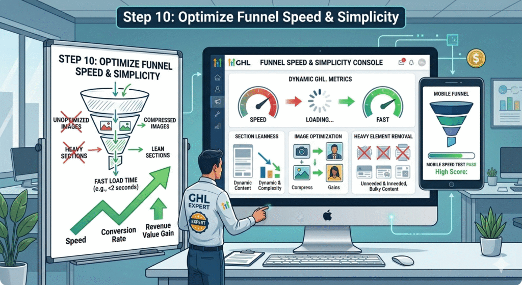
Inside GHL:
- Avoid heavy, unnecessary elements
- Keep sections lean
- Optimize images
- Test load speed on mobileSpeed is a conversion factor.A fully responsive funnel that loads slowly still loses revenue.
Why Design Quality Directly Impacts Funnel Conversion
Design is not decoration.
Design signals:
- Professionalism
- Reliability
- TrustworthinessFunnels with excellent designs:
- Feel intentional
- Reduce skepticism
- Increase perceived valueGeneric designs lower perceived quality — even if the offer is strong.
How Free Updates Inside GHL Protect Funnel Performance
One overlooked advantage of building funnels in GHL is free updates. Learn more about our GHL CRM setup service.
As GoHighLevel:
- Improves page builders
- Enhances mobile responsiveness
- Adds performance optimizationsFunnels built correctly benefit automatically.But only if:
- They follow a clean structure
- Avoid hacky workarounds
- Use native features intentionallyClean architecture ages better than shortcuts.
Common Funnel Mistakes SMEs Must Avoid
- One funnel for every audience
- Over-explaining instead of clarifying
- Ignoring mobile behavior
- Treating funnels as static assets
- Never testing or refiningFunnels are living systems — not one-time projects.
How High-Converting Funnels Support Scale Without Hiring
When funnels work:
- Fewer leads are wasted
- Sales teams talk to better prospects
- Follow-ups require less effort
- Conversion becomes predictableThis is why GHL funnels are a scaling lever, not just a marketing asset.
High-Converting Funnels Are Designed, Not Assembled
A high-converting GHL sales funnel is not about:
- More pages
- More steps
- More automationIt’s about:
- Clear intent
- Excellent designs
- Fully responsive execution
- User-friendly experiences
- Strategic use of free updates over time
- When funnels are built with this mindset, GoHighLevel becomes more than a tool — it becomes a revenue system.
- At GoHighLevel Expert Services, we don’t build funnels that “look done.”
- We build funnels that convert consistently, scale cleanly, and age well.
- Optimizing, Testing, and Scaling Your GHL Sales Funnel for Long-Term ConversionsWhy Building the Funnel Is Only 50% of the Work
- Most SMEs believe the hardest part is building a funnel.
- In reality, the hardest part is making sure the funnel:
- Continues converting as traffic scales
- Holds up across devices and audiences
- Improves over time instead of decayingAt GoHighLevel Expert Services, we often say:A funnel that isn’t optimized and tested regularly is not a funnel — it’s a temporary landing page.High-converting GHL funnels are maintained systems, not one-time builds.
Step 11: Understand Funnel Behavior, Not Just Funnel Metrics
Before optimizing, you must understand how users actually behave inside your funnel.
Instead of only tracking:
- Form submissions
- Bookings
- Conversion ratesAlso, pay attention to:
- Drop-off points
- Time spent on each step
- Mobile vs desktop behavior
- Repeated visits before conversionFunnels often fail silently at specific stages — especially on mobile.This is why fully responsive design is not a one-time checkbox, but an ongoing priority.
Step 12: Optimize Funnels Separately for Mobile and Desktop
A major mistake SMEs make is assuming one design works equally well everywhere.
In reality:
- Mobile users skim more
- Desktop users read more
- Mobile conversions rely heavily on speed and simplicityHigh-performing GHL funnels:
- Test mobile layouts independently
- Adjust spacing, font size, and button placement
- Remove unnecessary sections on smaller screensA funnel can look great on a desktop and still fail completely on mobile.Fully responsive does not mean “it fits the screen.”It means “it converts on the screen.”
Step 13: Refine Headlines Based on Objection, Not Creativity
Headlines are not branding exercises — they are decision triggers.
A high-converting funnel headline:
- Addresses a core pain point
- Signals relevance immediately
- Reduces skepticismTesting headlines inside GHL should focus on:
- Problem-first vs outcome-first
- Specific vs general language
- Risk-reduction framingExcellent designs attract attention, but headlines decide whether users stay.
Step 14: Use Micro-Commitments to Increase Final Conversions
High-converting funnels don’t ask for everything at once.
They use micro-commitments:
- Scroll
- Click
- Answer one question
- Select an optionEach small action increases psychological momentum.Inside GHL, this can look like:
- Multi-step forms
- Conditional logic
- Simple qualifying questionsThis makes the funnel more user-friendly and less intimidating.
Step 15: Remove Anything That Does Not Support the Primary Action
Conversion optimization is often subtraction, not addition.
Audit every funnel page and ask: See our GHL automation services.
- Does this help the user decide?
- Does this reduce doubt?
- Does this clarify the next step?If not, remove it.High-converting funnels are:
- Focused
- Clean
- IntentionalExcellent designs are not busy — they are disciplined.
Step 16: Optimize Forms for Completion, Not Information
Every extra form field reduces conversion.
Best practice inside GHL funnels:
- Ask only what you need now
- Collect secondary data later via automation
- Clearly label required fields
- Use inline validation where possibleForms should feel effortless.A user-friendly form feels like a conversation — not an interrogation.
Step 17: Use Confirmation Pages as Conversion Multipliers
Confirmation pages are some of the most underutilized assets in funnels.
Instead of a basic “Thank you” message, use confirmation pages to:
- Reinforce the decision
- Explain next steps clearly
- Reduce post-conversion anxiety
- Increase show-up ratesHigh-performing GHL funnels treat confirmation pages as trust anchors rather than placeholders.
Step 18: Optimize Follow-Up Timing and Channel Mix
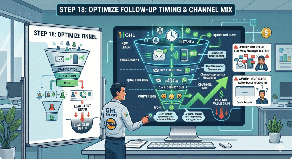
Automation is powerful — but timing is everything.
High-converting funnels use:
- Immediate confirmation (SMS or email)
- Short reminder sequences
- Channel-appropriate messagingAvoid:
- Too many messages too fast
- Long gaps that allow doubt to creep in
- Over-automation that feels roboticA funnel should feel responsive, not aggressive.User-friendly communication builds confidence.
Step 19: Test One Variable at a Time (Not Everything at Once)
One of the biggest optimization mistakes is changing too much at once.
Effective testing focuses on:
- One page
- One element
- One hypothesisExamples:
- Headline change
- CTA wording
- Form length
- Button placementThis allows you to learn what actually improves conversions.Funnels improve through intentional iteration, not guesswork.
Step 20: Build Funnels That Scale Without Breaking
As traffic increases, funnels face new pressures:
- Higher mobile traffic
- Broader audience awareness
- More edge casesScalable funnels:
- Have simple logic
- Avoid brittle hacks
- Use native GHL featuresThis is where free updates inside GoHighLevel become an advantage.Funnels built cleanly benefit automatically as the platform improves.
Step 21: Keep Funnel Architecture Clean for Long-Term Health
Over time, many funnels become cluttered:
- Duplicate workflows
- Old pages left active
- Conflicting automationsHigh-performing teams regularly:
- Archive unused assets
- Rename workflows clearly
- Document funnel logicClean architecture protects conversion rates as systems grow.
Step 22: Design Funnels for Trust, Not Pressure
Pressure-based funnels can work in the short term — but they burn trust.
In 2026 and beyond, buyers respond better to:
- Clear expectations
- Professional presentation
- Calm confidenceExcellent designs signal stability.User-friendly flows signal respect for the buyer’s time.Trust converts better than urgency when funnels scale.
Step 23: Align Funnels With Sales Reality Book a free consultation →
A funnel should reflect how your sales process actually works.
If:
- Sales calls are consultative, funnels should educate
- Sales cycles are short; funnels should simplify
- Qualification matters, funnels should filterFunnels that misrepresent the sales experience create friction later.Alignment improves close rates — not just lead volume.
Step 24: Use Funnel Data to Improve the Entire Business
High-performing GHL funnels generate insights, not just leads.
Analyze:
- Which objections stall conversions
- Which messages resonate most
- Where confusion appears repeatedlyThese insights can improve:
- Sales scripts
- Website messaging
- Offer clarityFunnels are feedback systems — not just marketing assets.
Step 25: Revisit Design and UX Quarterly
Design expectations change.What looked modern a year ago may now feel dated.
Quarterly funnel reviews should include:
- Visual freshness
- Mobile usability
- Page speed
- Consistency across stepsExcellent designs must evolve to remain excellent.
Step 26: Let Funnels Age Gracefully With Platform Improvements
One overlooked benefit of building inside GHL is free updates.
As GoHighLevel:
- Improves page builders
- Enhances mobile responsiveness
- Adds optimization featuresFunnels built correctly continue to benefit without rebuilds.This is why:
- Clean structure
- Native features
- Simple logicoutperform clever hacks long-term.
Step 27: Avoid Funnel Sprawl as You Add More Offers
As businesses grow, they often create:
- Too many funnels
- Slight variations of the same flow
- Confusing internal systemsInstead:
- Reuse proven structures
- Clone and refine intentionally
- Standardize design patternsConsistency improves efficiency and performance.
Step 28: Train Teams to Respect Funnel Integrity
Funnels break most often due to internal changes:
- Someone edits a page casually
- A workflow is adjusted without testing
- Messaging is changed inconsistentlyHigh-performing teams:
- Control access
- Document changes
- Test before publishingFunnels deserve the same discipline as revenue systems — because that’s what they are.
Ready to implement this in your GHL account?
Book a free 45-minute strategy call. Our certified GoHighLevel specialists will audit your setup.
Get Your GHL Setup Done Right
Free 45-min audit call — zero cost, no commitment.
Our GHL Services
- GHL CRM Setup
- GHL Virtual Assistant
- Funnel Builder
- Automation Specialist
- White-Label SaaS
- GHL Migration
Popular Posts
- High-Converting GHL Sales Funnel
- GHL Automation Templates
- GHL Pipeline Management